Maximize your CVR
for Free

- Read
- Scroll
- Click
over 1,300 companies trust Mieruca Heatmap


What can you do?
Learn user's behavior with three heatmaps. Mieruca Heatmap is free forever.
Visualize Issues of Your Page with These Three Heatmaps
users are exiting from
How to Miximize Your Conversions
with MIERUCA HEATMAP
01
User Scroll Heatmap
and Find High-exit Section
and Find High-exit Section
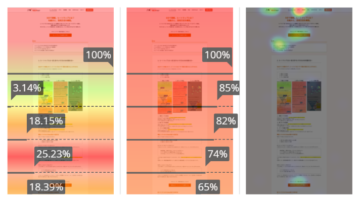
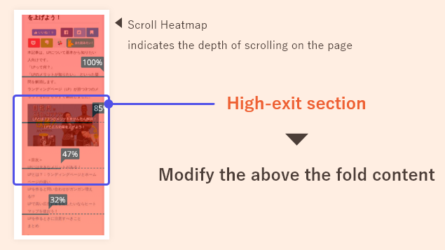
Our scroll heatmap displays the percentage of users who continue scrolling after landing on the page. If there is a noticeable decline in thse numbers, it indicates that many users are exiting the page within that section.
A high-exit section signifies a loss of user interest. To reduce the exit rate and encourage scrolling, consider enhancing the content, removing or replacing the section with more engaging content that captures users' attention.
A high-exit section signifies a loss of user interest. To reduce the exit rate and encourage scrolling, consider enhancing the content, removing or replacing the section with more engaging content that captures users' attention.
02
Use Read Heatmap
and Find Highly Engaging Section
and Find Highly Engaging Section
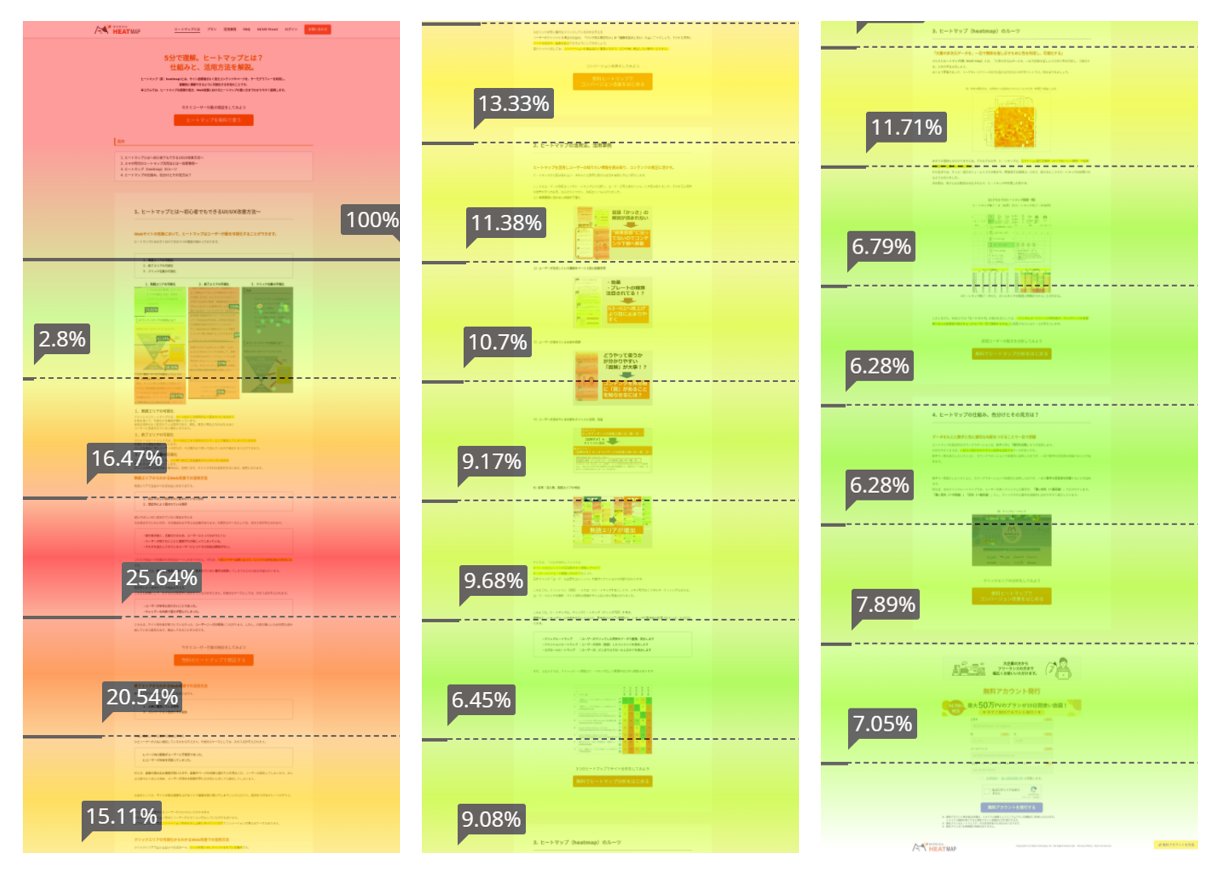
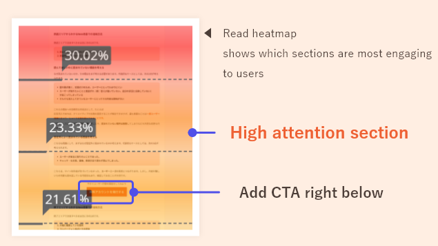
Read heatmaps reveal sections of high user attention or engagement, with red or orange indicating areas of interest, while green or blue represent sections with minimal user interest.
By strategically placing CTAs near or below these high-attention sections, you can effectively boost conversions on your page.
By strategically placing CTAs near or below these high-attention sections, you can effectively boost conversions on your page.
03
Use Click Heatmap
and Check the CTA Quality
and Check the CTA Quality
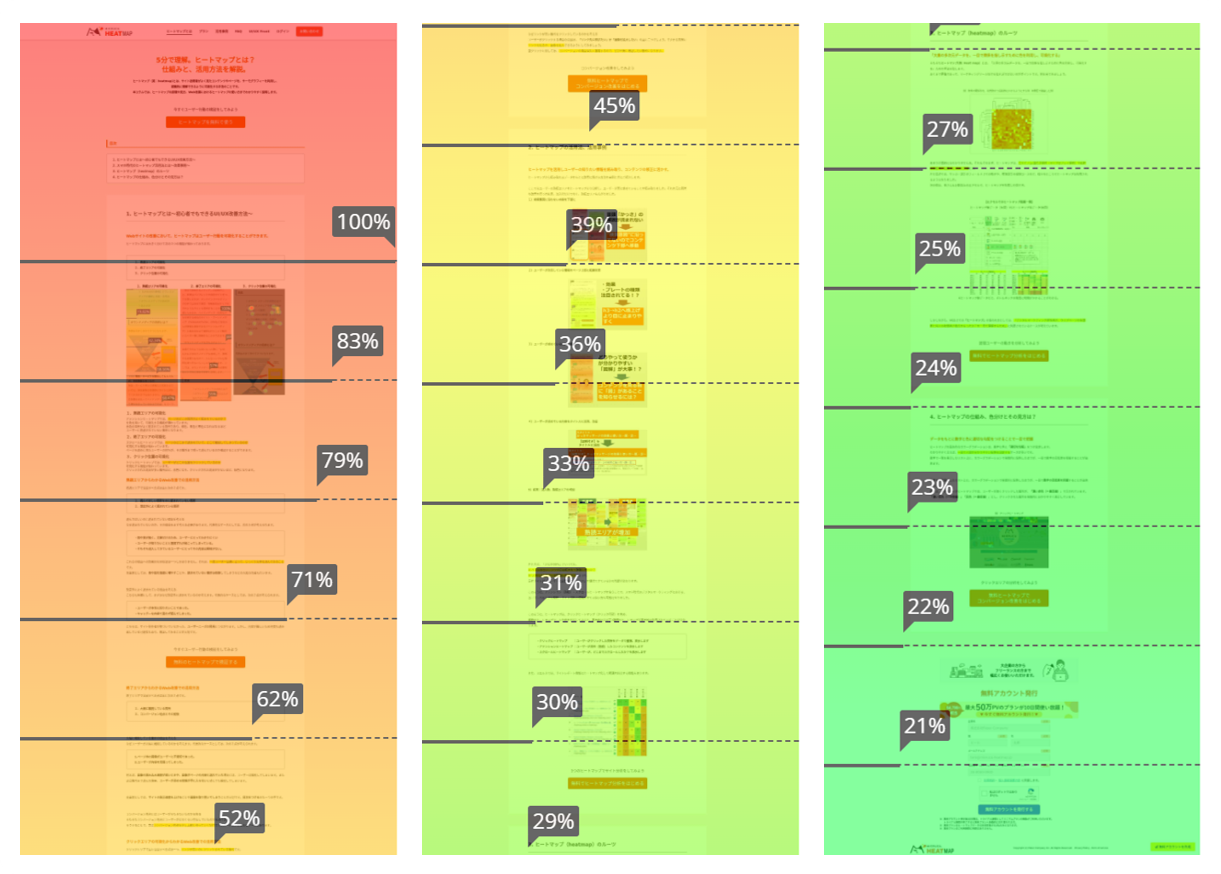
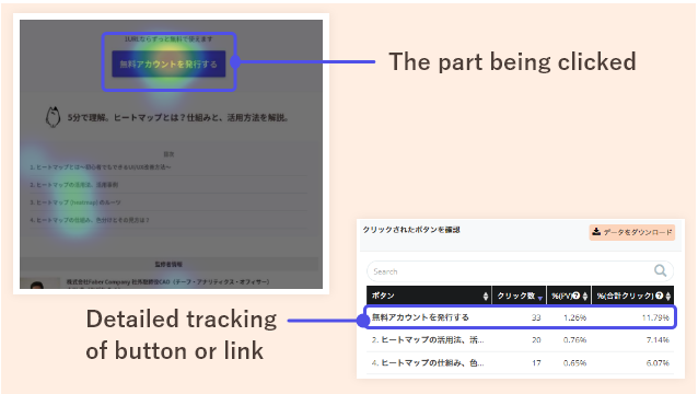
Our click heatmap shows which areas and buttons are clicked on a page, along with detailed click count tracking for each button or link. This data helps improve CTA and button design.
If the click-through rate is low, consider changing the button text or design to potentially increase conversions.
If the click-through rate is low, consider changing the button text or design to potentially increase conversions.
04
Create Pop-ups without Any Coding
and Boost Your Conversion Rates
and Boost Your Conversion Rates
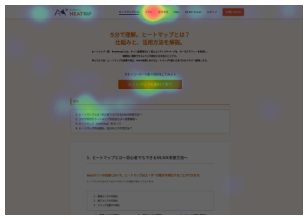
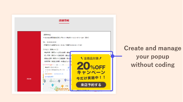
With Mieruca Heatmap, you not only have the power to analyze heatmaps but also seamlessly set up popup displays.
By strategically placing popups in high-exit sections, you can effectively reduce user bounce rates. Similarly, by targeting high-attention sections, you have the potential to drive even greater conversion rates.
By strategically placing popups in high-exit sections, you can effectively reduce user bounce rates. Similarly, by targeting high-attention sections, you have the potential to drive even greater conversion rates.

.jpg)



.png)


